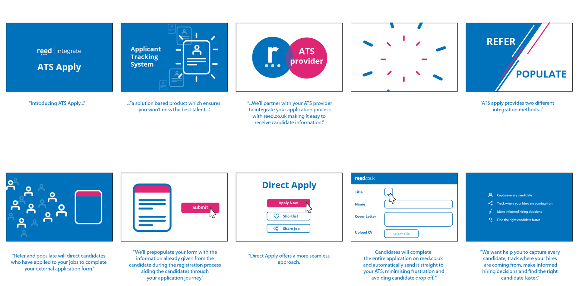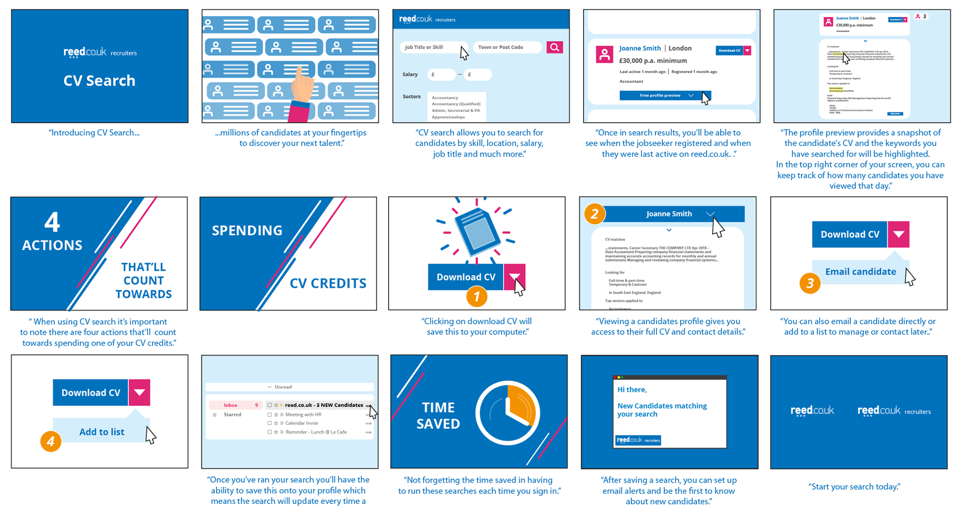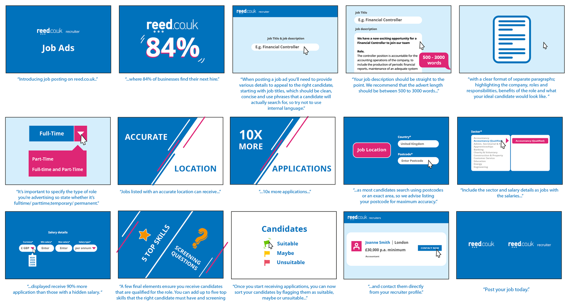

Reed.co.uk needed a series of motion video's that communicated its offering in a way that was clear, engaging and quick to consume.
The video's had to simplify possibly complex ideas, such as career search steps, service benefits, or user journey, into a friendly, accessible format for a broad audience.
The challenge was to translate abstract or information-heavy content into a narrative that grabs attention, conveys value, and fits the tone of a modern job-market platform.
My Role
I took on full responsibility for the project — from concept and storyboarding through to final animation, editing, and delivery. I shaped the visual identity, designed all assets (illustrations, icons, typography), built the animation sequences, and managed the motion graphics production end-to-end. Essentially, I was the creative-lead, designer, and animator rolled into one, ensuring cohesion, consistency, and quality across the project.
Approach & Process
Concept & Storyboarding: Started with a narrative outline and rough storyboard to map the video’s story arc — deciding key frames, transitions, where messaging and visuals would align. Storyboarding helped pre-visualise pacing, flow, and where visual emphasis was needed.
Style & Visual Design: Created a clean, modern design language: simple iconography, clear layout, and colour/typography choices that align with the brand identity. The aim was clarity and readability while remaining visually appealing.
Animation & Motion Graphics: Applied motion-design principles — smooth transitions, pacing, emphasis on key messages using animation timing to guide attention, and well-timed visual emphasis on important statements. The animation style was deliberate, designed to support comprehension and engagement rather than distract.
Narrative & Storytelling: Structured the video to follow a logical flow: introduce problem/context → outline solution/service → highlight benefits/value → call to action. This storytelling structure helps guide viewers and ensures the message lands effectively. Using animation allowed complex or abstract service features to be visualised simply and engagingly.
Polish & Quality Control: Paid careful attention to timing, transitions, icon consistency, and motion clarity — ensuring everything felt smooth and professional. Ensured that the final video was optimised for digital delivery (compressed, readable at web-video resolutions, clean animation playback).